The Evil Green

The path of learning painting for me has been a path of unlearning what I was taught as a kid: the sky is blue, the grass is green, the trees are… green too. One might think that our world can be painted blue and green. 

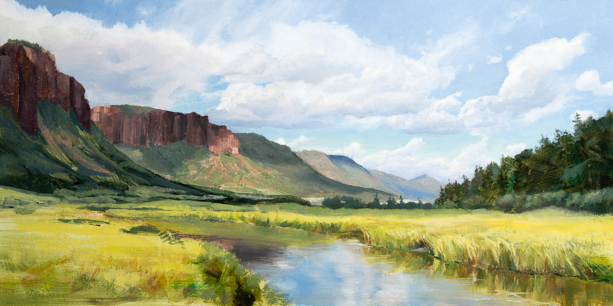
It is far from being so. I have not seen pure green in nature yet. The “green” trees in the distance are reddish blue and the green lawn can be yellow or brown or blueish depending on light. 

Unlearning all that and learning to trust my eyes instead of my brain was hard.

My biggest struggle has been greens. For a while I was trying different kinds of greens sold in tubes, but nothing worked. My paintings continued to look cartoonish. Even when I learned that things we consider “green” were not actually green I still automatically would reach for greens on my palette when painting grass or trees. It was just that deeply ingrained in my mind. 

Tough problems demand out of box and sometimes radical solutions. My solution was to remove greens from my palette completely. That forced me into mixing “green” using other colors and doing that forced me to be mindful of what kind of green was needed. It also forced me to explore and experiment with different mixtures to find the green I wanted.

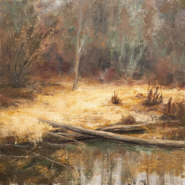
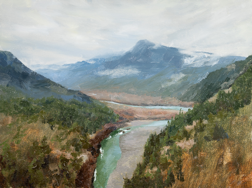
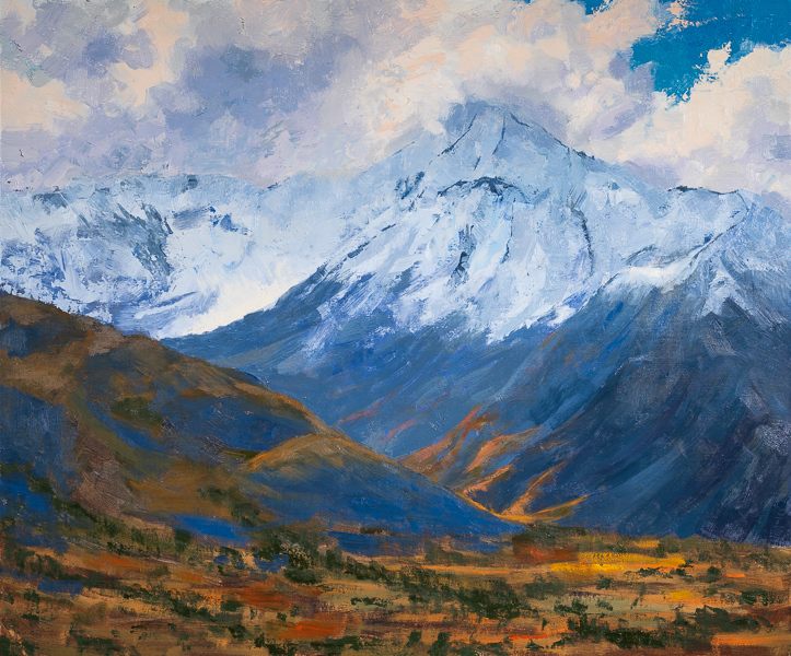
Almost a year I painted without any green on my palette. I have learned that foliage can be of many different colors: black mixed with cadmium yellow for dark firs, ultramarine blue mixed with burnt sienna on the slopes of distant mountains, ultramarine blue mixed with cadmium orange in shadows of the middle ground, or ultramarine blue mixed with cadmium yellow and some burnt sienna in the deep shadows of foreground, or ultramarine blue and cadmium yellow pale in highlights or sometimes even pure yellow pale mixed with white when the leaves vibrate in the hot summer sun.

And many other yellows (yellow ochre, cadmium yellow deep, lemon yellow), mixed with all kinds of blues (ultramarine blue, cobalt blue, cerulean blue, phthalo blue). All give many different shades of green. With all the rich shades of green I discovered I pretty much forgot about out of the tube greens.

Only recently I added some Viridian to my palette. But I use it carefully and rarely. 

Limited Palette

That’s one of those things that I wish I started with. Instead, I started with a palette of six colors plus black and white plus my teachers would throw in a few more colors because they would work well with a scene we were painting. It was overwhelming. I was very confused most of the time. I tried to memorize what to mix with what to get which color and it was too much.

The breakthrough came when I learned about limited palette. It turns out that a lot can be done with just three primary colors and white. The easiest three colors to start with are ultramarine blue, cadmium yellow and cadmium red. Black can be achieved by mixing those three, green can be achieved by mixing blue and yellow, orange by mixing yellow and red, and so on.

I painted with this limited palette for a few months. My painting improved and I was developing the sense of color faster.

Once I got comfortable with those three colors, I tried to add more colors, but it didn’t work. I instinctively kept reaching for familiar colors.

That was until I heard from another painter that the limited palette can be constructed with some other primary colors. For example, phtalo blue, alizarin crimson and yellow ochre. Now that was a fun triad to tame.

Both phtalo blue and alizarin crimson are very intense colors. Especially, phtalo blue. It is so intense that at some point I gave up on it because even with a lot of neutral I could not tame it. That’s why it was a lot of fun to, finally, learn to control it. The painting in this post is painted with phtalo blue, alizarin crimson, yellow ochre and white.

And an interesting thing happened when I let both of those triads on my palette. I was freely mixing and using all of them in a single painting.

That what I was experimenting with last winter. Then nice weather came to the Pacific Northwest and I put experiments aside to spend most of the time painting pleinair with the palettes I’ve already learned.

Once rainy days again will force me to stay inside, I want to experiment with palettes that have no blue. It is quite unusual. The idea came after I discovered that mixing viridian green and cadmium red gives a gentle blue. Mixing viridian with alizarin crimson gives even deeper blue. Adding some kind of yellow would complete the triad.

White is not what it seems

I’m learning to paint for over three years now. It is not easy. It has never been and, I suspect, never will. It is a lot of hard work.

My progress came in qualitative jumps. That is, I painted a lot without much progress but with a lot of frustration until I finally grasped some important concept. At which point my paintings became much better and I became much happier for a short while. Until tension to progress further built up again.

Looking back one of the things I wish I did differently is to start with studying some fundamental concepts that I picked up along the way. I’ll try to capture some of those concepts in a series of blog posts, maybe not in a very systematic way.

The first concept is that things do not look the way we know they do. For example, we say a white cup. We define a cup as being white. Does it mean we use white to paint it? Wouldn’t that mean that a blank white canvas already has the white cup painted on it? And if so, why can’t we see it there?

It turns out that the white cup is not white, it is a multitude of distinct colors, depending on the sources of light. My first eye opening and memorable learning experience was painting a white cup on a white plate on a white table. What an exquisite kind of torture it was! But I’ve learnt to see the distinct colors that form our perception of those objects. (That is the painting at the top of this post. 3 years old.)

Later I’ve learnt about cube studies. Cubes of assorted colors laid out on a table, and you need to paint them (extra bonus: in different light condition). The idea is essentially the same: learning to see distinct colors, temperatures, values in shade vs in light vs in reflected light. Cube is the simplest shape to draw and that removes the pressure of drawing of something as a cup out of the exercise, it becomes only about colors. I would start it with white cubes on a white table. That’s the simplest and purest form of it, the first step to understanding that things don’t look the way we are taught they do.

Elhwa Valley

There is a viewpoint overlooking Elhwa Valley along Route 101 on Olympic Peninsula. I’ve passed that viewpoint many times on the way to the Olympic coast. I’ve stopped some of those times appreciating the vast expanse of the valley, and the mountain peaks, sometimes bear, other times covered in snow, and the fog sitting in the valley or clouds clinging to the mountains or leisurely travelling from one mountain to another. No matter the season there are always clouds there, and the view is never the same.

I have not been able to take a good photo of it for a quite simple reason. The viewpoint was likely done long ago. Since then, a fresh growth of young trees has obstructed the view.

Technology came to the rescue. The last time I went there I took a drone to fly over those annoying trees and get a clear picture of the valley. After that I spent time looking at the view, trying to memorize as much as I could the colors and the feeling of the place.

***

There are a couple challenges in painting using a photograph as a reference. First, photographs miss a lot of information that a human eye and mind can capture. I have not yet succeeded in painting from a photograph of a place I’ve never been to. It was not the challenge in this case.

The other challenge is that there are too many details in a photograph. I quickly get lost in the details and lose focus on larger shapes.

Recently, I’ve heard an interesting suggestion from another artist to paint upside down, it confuses the mind and instead of seeing trees, mountains, and rivers, it sees triangles, lines, and other shapes. And it helped.

The first layer of this painting was done upside down. It was very confusing and made no sense. But it was easy to follow: big triangle here, smaller triangle over there and a curvy line in between.

Then I turned it the right side up. My mind started putting things together. It did not happen immediately. A picture of a valley was appearing in front of me, almost like magic.

***

Then there was a fun part to this painting. I needed to blend the edges between the brush strokes to soften the sky. The easiest way was to use fingers for that. And so I did.

To avoid messing up the values and temperatures I used different fingers in different places. At the end I had a palette of 4 sky colors on my fingers from darker and cooler to lighter and warmer. The child in me said “let’s play”, and I started adding details in the sky using my finger palette.

Fingerpainting is not only for kids, adults can do it too.

My Oil Painting Journey: The Beginning

Covid was quite disruptive for our everyday lives. A lot changed at that point. We had to cope, to overcome, to adapt.

I won’t delve into all the emotions and challenges I had to deal with, except one: the extra free time I had to fill in. I did not have to go to the office and as it turned out commuting took up a significant part of my life. Working from home, I suddenly got all that time back. I did not want to spend all that time wallowing in misery about all the plans that were ruined by covid. So, I needed to find something to occupy myself with.

Let me step back a bit. Actually, let me step back a lot. When I was a kid one of the dreams I had was to paint. I don’t know how it happened, but I convinced myself that I don’t have an aptitude for painting. I did not even try. Instead, I turned to photography as my outlet for visual creativity. It was quite limited at that. I was always frustrated that image would not come out the way I saw the scene. The photograph was more exciting and captivating in my memory than in camera’s memory. Yet, I persevered and, hopefully, produced some interesting images, while dreaming about painting all that time.

Now let’s step forward again to the time when covid started. I had a lot of extra free time and a lot of uncertainty about the future. The uncertainty was causing a lot of anxiety and I wanted to anchor myself in some activity I would be passionate about.

That’s when I remembered about my childhood dream. I contacted an art teacher (and amazing artist) and started taking oil painting lessons. I had to buy a lot of supplies (funny enough at the beginning I told the teacher that at least painting was not as expensive as photography, and now I can say I was wrong).

I was deeply committed to learning the craft. I painted every day. I would do still-lives at home: I would pick some fruit I had in the kitchen or put some random stuff on the table and start painting it. Weather permitting, I would take out my easel somewhere close to home (since all parks were closed) and try to paint landscapes.

Learning was not easy. There was a lot of frustration at inability to layout on canvas what I had in my mind. In the worst fits of it I broke canvases and brushes. There was a lot of despair at the lack of progress with me sitting and crying. But I persevered through being tired, confused, exhausted.

At this point I am more comfortable with color; I can play and experiment with it without making my paintings look garish; a couple of my paintings are in a gallery. But as with anything else, the more I learn the more I know how little I know.

Looking back at the three years that passed I can see interesting patterns in my learning, and I’d like to share some tricks or key concepts I learned. (I won’t pretend that I have any authority or qualifications to teach, I simply have a few things to say.)

Beauty is in Details

I’m still experimenting with this technique of multiple exposures over long period of time combined in one image and I like  results better and better. I think I’m onto something. Look at this image. Pretty trivial and  obvious composition. The first thing to note is that clouds look like they are painted.

Then I looked closely at different elements in the image and liked this technique even more. Here is a fragment of a field on the right:

And here is the tree enlarged:

Both elements look like painted. The road is the only element that remains looking as a photograph. This combination of photographic look and painting look creates quite an interesting effect. I’m eager to start printing this to see how it looks in full detail print.

Make Photo

Rick Sammon likes to say “Don’t just take photos, make photos”. It is a great advice. And the photo in this post is a great example of that.

I had photographed this tree a few days before and came back to Kubota Gardens that day with a single goal to make more interesting picture of this tree. I got “inside” the tree. It was cozy and warm inside under the canopy of red and yellow leaves. I started with the same kind of photos at before. They were typical photos of branches with fall leaves.

Then I noticed a single leaf caught in the middle of a tree where many branches were coming out from the main trunk. Now, that was interesting. I took a few photos.

The single leaf did not really stand out it was blending in with the branches. There was a simple solution to that. I grabbed a bunch of leaves that were already on the ground and dropped on top of the single leaf. Now they had a party.

I took a few images again. It was nice but it was plain. The image of something mystical started brewing in my head. What if I make an image of a Heart of Autumn. The heart of autumn would be glowing. And a flash light could help with that.

Fortunately, I had a powerful spot light in my car (well, I always have several flashlight in my car). I overcame my laziness and packed my gear, went back to the car, grabbed the spotlight and went back to the tree.

Now I was shooting with a spot light. It took a few iterations to get light spot right in the middle of the pile of leaves. I still did not feel like I got it. The leaves in the background were as bright as those I was lighting up. it did not feel like leaves at the heart of the tree were glowing. The solution was to make reduce overall exposure of the image, while get more light on the leaves that I wanted to glow.

The end result:

Heart of Autumn
Heart of Autumn

A Dream About Water

I’ve wrote about light painting before and I’ll likely write more again as this really fascinates me in photography. For me it is a lot of fun playing with lights, a lot of creativity as I create something that was not there in the first place, and a lot of surprise as most of the time what I get is unexpected.

Here is an image that got me very excited about light painting again. I spent a day photographing fall foliage in Kubota Gardens in Seattle (I’m still working on post-processing those photos). At dusk as it got dark enough for exposures to go up to 30 seconds I started playing with light painting with two waterfalls I found in the gardens.

I found the upper waterfall to be more interesting of the two because it had red leaves caught in the stream and I could get a more dynamic image with foreground and background.

There were two new things I played with this time. First, I brought two different flashlights: one had cool light and the other one had warm light. So, I could do not only light painting but also color painting. The other thing that I played with was focus, shifting focus in the middle of light painting. This created dreamy effect.

For those interested in more technical details here is how I took this image. The camera was on a tripod, aperture wide open (f/4 for the lens that I used), shutter was 30 seconds. It was pretty dark already, my camera was not able to focus just using ambient light. First I would use very powerful warm flashlight. I would point to a rock in the middle of the frame and focused the camera using auto focus. I would turn off auto focus then. Turn off the flashlight, so it does not light up something accidentally, and release shutter. Then quickly with the same powerful warm light I would trace the waterfall and the creek back and forth a few times to ensure that individual spots or streaks of light a now visible. That was taking me about 5 seconds. Then I would turn off flashlight and defocus the lens. The rest of 25 seconds I was using weak cool flashlight to light up sides of the frame while the camera was out of focus. I did this ten times or more, every time getting a different image – I love the element of surprise. This I think is the best out of the series.

A Dream About Water
A Dream About Water

Path of Light

Photography has been and hopefully remain as much about playing and experimenting. One of such fun things is to introduce an artificial light sources in a landscape. The official term for it is “light painting” but for me it is just playing with flashlights, imagining what a landscape can be, and then getting a surprising result.

Like in this photo that I took at the Second Beach in Olympic National Park just after sunset, when it was dark enough for a long exposure and dark enough for a flash light (actually 3 flashlights) to make a difference.

Path of Light
Path of Light

Image vs. Print

This question bugged me for a while: is an image an ultimate goal and result of creativity or execution and presentation are important as well? And I came to conclusion that execution and presentation are important.

Let’s talk about paintings for example. I think of paintings not only as two dimensional images. There is a third dimension – brush strokes. They capture artist hand motion and his emotions as much as color, composition or subject. When I look at those strokes I can imagine how the artist hand was moving, and that passes artist emotions to me. The brush strokes can be powerful, forceful, angry or they can be casual, light and soft. A reproduction of a painting can have accurate representation of an image but does not capture the brush strokes as well and in some sense erasing that third dimension.

I grew up in a fairly provincial town seeing only reproductions of paintings in books. Seeing them later in museums changed my perception of them completely. I remember how seeing one of van Gogh’s self-portraits in Seattle Art Museum (in a temporary exhibition) made unforgettable impression on me. Much of van Gogh’s face was not painted. Either skin-toned paper was used or paper was covered with skin-toned paint. And then on top of that van Gogh painted his beard, eyes, hair. It was like the face was already in that skin-toned paper, van Gogh just helped me to see it in a few brush strokes. No reproduction has been able to show that.

Now the paintbrush strokes can be meaningless too. For example, I have some cheap painting hanging in my house. It may have been produced by printing on canvas first and then laying paint on top to make it look like painting, the paintbrush strokes just random and “don’t fit”. That’s kind of example of good image bad painting. Another example of good image and good painting but where strokes don’t mean much [to me] is Pointillism which branched off Impressionism. In paintings that I’ve seen in museum executed with this technique application of dots looks very mechanical. While technique is interesting it did not give enough freedom to artist hand.

Same goes to photography but in photography it is a matter of technology and not directly related to us. Platinum-palladium print has incredible tonal range and looks like the image is in paper, where print from inkjet printer looks like image is coated on top of paper, like a polaroid emulsion transfer (in some sense). All that is left to us is to choose what matches what we want the best. And don’t get me even started on paper, I have ton of paper samples at home and I just enjoy looking at them and feeling their texture.

Is this important to most of people? No. Paintings are not much of importance either. And even famous ones. Have you been to Musée du Louvre and saw Mona Lisa? Have you looked at the crowd? How many people were looking at the painting and how many were actually with their backs toward the painting taking infamous “hey, I’m 10 feet from Mona Lisa painting” photo? And using flash despite all “no flash” signs? I like this statistic from Wikipedia: “Visitors generally spend about 15 seconds viewing the Mona Lisa.” Is it really worth only 15 seconds? (Granted it may have lost its value as painting and has become something else. Sadly.)

So what can we photographers do? We can do our best explaining this and teaching everyone to see this. Even if the rest think we are a bit crazy.