The Evil Green

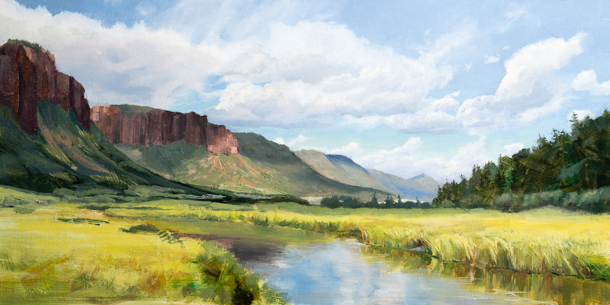
The path of learning painting for me has been a path of unlearning what I was taught as a kid: the sky is blue, the grass is green, the trees are… green too. One might think that our world can be painted blue and green. 

It is far from being so. I have not seen pure green in nature yet. The “green” trees in the distance are reddish blue and the green lawn can be yellow or brown or blueish depending on light. 

Unlearning all that and learning to trust my eyes instead of my brain was hard.

My biggest struggle has been greens. For a while I was trying different kinds of greens sold in tubes, but nothing worked. My paintings continued to look cartoonish. Even when I learned that things we consider “green” were not actually green I still automatically would reach for greens on my palette when painting grass or trees. It was just that deeply ingrained in my mind. 

Tough problems demand out of box and sometimes radical solutions. My solution was to remove greens from my palette completely. That forced me into mixing “green” using other colors and doing that forced me to be mindful of what kind of green was needed. It also forced me to explore and experiment with different mixtures to find the green I wanted.

Almost a year I painted without any green on my palette. I have learned that foliage can be of many different colors: black mixed with cadmium yellow for dark firs, ultramarine blue mixed with burnt sienna on the slopes of distant mountains, ultramarine blue mixed with cadmium orange in shadows of the middle ground, or ultramarine blue mixed with cadmium yellow and some burnt sienna in the deep shadows of foreground, or ultramarine blue and cadmium yellow pale in highlights or sometimes even pure yellow pale mixed with white when the leaves vibrate in the hot summer sun.

And many other yellows (yellow ochre, cadmium yellow deep, lemon yellow), mixed with all kinds of blues (ultramarine blue, cobalt blue, cerulean blue, phthalo blue). All give many different shades of green. With all the rich shades of green I discovered I pretty much forgot about out of the tube greens.

Only recently I added some Viridian to my palette. But I use it carefully and rarely. 
Limited Palette

That’s one of those things that I wish I started with. Instead, I started with a palette of six colors plus black and white plus my teachers would throw in a few more colors because they would work well with a scene we were painting. It was overwhelming. I was very confused most of the time. I tried to memorize what to mix with what to get which color and it was too much.

The breakthrough came when I learned about limited palette. It turns out that a lot can be done with just three primary colors and white. The easiest three colors to start with are ultramarine blue, cadmium yellow and cadmium red. Black can be achieved by mixing those three, green can be achieved by mixing blue and yellow, orange by mixing yellow and red, and so on.

I painted with this limited palette for a few months. My painting improved and I was developing the sense of color faster.

Once I got comfortable with those three colors, I tried to add more colors, but it didn’t work. I instinctively kept reaching for familiar colors.

That was until I heard from another painter that the limited palette can be constructed with some other primary colors. For example, phtalo blue, alizarin crimson and yellow ochre. Now that was a fun triad to tame.

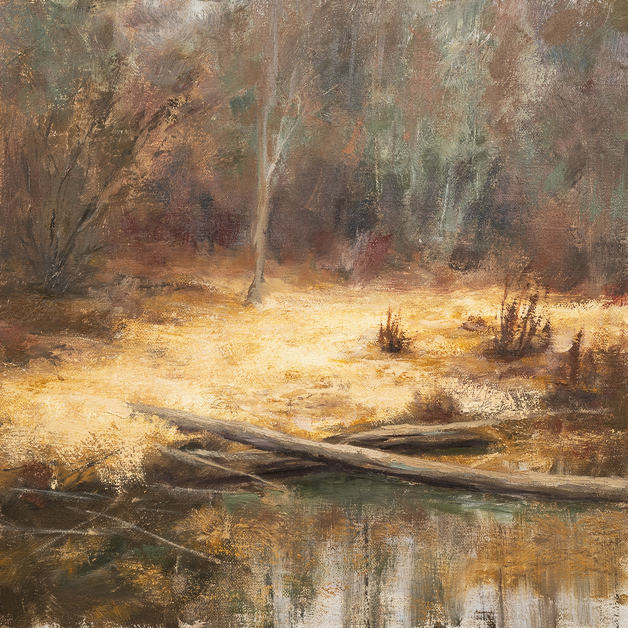
Both phtalo blue and alizarin crimson are very intense colors. Especially, phtalo blue. It is so intense that at some point I gave up on it because even with a lot of neutral I could not tame it. That’s why it was a lot of fun to, finally, learn to control it. The painting in this post is painted with phtalo blue, alizarin crimson, yellow ochre and white.

And an interesting thing happened when I let both of those triads on my palette. I was freely mixing and using all of them in a single painting.

That what I was experimenting with last winter. Then nice weather came to the Pacific Northwest and I put experiments aside to spend most of the time painting pleinair with the palettes I’ve already learned.

Once rainy days again will force me to stay inside, I want to experiment with palettes that have no blue. It is quite unusual. The idea came after I discovered that mixing viridian green and cadmium red gives a gentle blue. Mixing viridian with alizarin crimson gives even deeper blue. Adding some kind of yellow would complete the triad.

Make Photo

Rick Sammon likes to say “Don’t just take photos, make photos”. It is a great advice. And the photo in this post is a great example of that.

I had photographed this tree a few days before and came back to Kubota Gardens that day with a single goal to make more interesting picture of this tree. I got “inside” the tree. It was cozy and warm inside under the canopy of red and yellow leaves. I started with the same kind of photos at before. They were typical photos of branches with fall leaves.

Then I noticed a single leaf caught in the middle of a tree where many branches were coming out from the main trunk. Now, that was interesting. I took a few photos.

The single leaf did not really stand out it was blending in with the branches. There was a simple solution to that. I grabbed a bunch of leaves that were already on the ground and dropped on top of the single leaf. Now they had a party.

I took a few images again. It was nice but it was plain. The image of something mystical started brewing in my head. What if I make an image of a Heart of Autumn. The heart of autumn would be glowing. And a flash light could help with that.

Fortunately, I had a powerful spot light in my car (well, I always have several flashlight in my car). I overcame my laziness and packed my gear, went back to the car, grabbed the spotlight and went back to the tree.

Now I was shooting with a spot light. It took a few iterations to get light spot right in the middle of the pile of leaves. I still did not feel like I got it. The leaves in the background were as bright as those I was lighting up. it did not feel like leaves at the heart of the tree were glowing. The solution was to make reduce overall exposure of the image, while get more light on the leaves that I wanted to glow.

The end result:

Heart of Autumn
Heart of Autumn

Pastel Colors of Fall

Finally, the colors of fall foliage is behind us. It is my favorite time of year. For photographers October is like August for farmers – time to collect the harvest. The reason I’m saying “finally” is because I felt burnt out pushing myself too much trying to capture it a s much as possible. For some time I tried to keep up with post-processing but then gave up – I was not getting enough sleep that way. And that was combined with two more art shows that I needed to get ready for.

Now, when fall foliage is almost gone in Pacific Northwest and my last art show of this year is behind me, I can catch up on post-processing, blogging, planning.

***

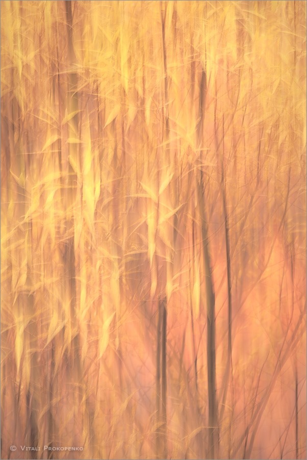
For a few months I’ve been fascinated with pastel colors. I like their subdued soft feel. So, this fall I’ve done several images with intent of having pastel colors.

An important thing about photographing color is to be clear that the subject of a photo is color, not individual branches, leaves or trees. To me it means getting rid of all those details in an image.

One technique to do that is to take photos with long exposure handheld and intentionally move camera in some direction. It seems to work the best when moving camera along visually strong lines such as tree trunks or branches.

On Fire
On Fire

Fall Butterflies
Fall Butterflies

Fall Forest
Fall Forest

Taking Advantage of Imperfections

I’m increasingly photographing with more and more challenging lighting. Such as including sun high in the sky into the picture. The creates a lot of glare in the photo. And I’m working thru those issues, finding how to avoid them or incorporate them in my pictures.

There is a couple methods I use to avoid glare in my pictures. First one that I used for a while already is to block out the Sun with a finger, take photos without the Sun and the glare. The next photo is with no fingers in the frame. Both photos should be taken with the same exposure, the same focus point, the same aperture and on tripod. I would take the normal photo as a base and then use the one where I blocked out the Sun to patch any areas with a glare. This methods works really well during sunset or sunrise when the Sun is placed closer to an edge of a frame.

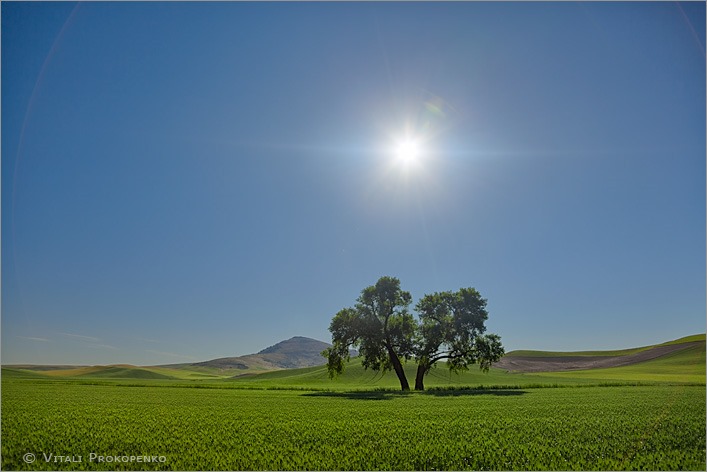
The other method I discovered during my trip a week ago to the Palouse. Turns out that if I open aperture to its widest setting I get almost no glare or at least its impact becomes imperceptible. This method works well even if the Sun is in the middle of the frame. That’s the technique I used for the photo below that I took during the trip.

Again I would use the photo with aperture set to where I want it. In this case I wanted to close down aperture to get sun burst rays. Closing down the aperture produced a lot of glare in the sky, on the Steptoe Butte and in the fields, that would be hard to patch in Photoshop if I did not take another photo with open aperture and used parts of that photo to patch out all the glare.

Then I discovered that polarizer that I had on my lens had imperfection that resulted in light spilling further from the Sun in two directions along one line. (And just in case you did not know any additional glass surface adds more glare to the photo as sun light bounces back and forth between glass surfaces.) My first reaction was to remove the filter. But then I thought of incorporating that effect and make that line horizontal by rotating the filter. Later I also did take photos without the filter but I like the one with imperfection more. It gives some surreal feel to the scene.

_MG_3000

On the Other Side

I went to Olympic National Park again, just 3 weeks after last time. The last time it was all about visiting old friends. This time it was about making new.

I like the saying “The real voyage of discovery consists not in seeking new landscapes but in having new eyes.” by Marcel Proust. It has been my guide in photography for long time. But… sometimes we can let our mind rest and let legs do the work.

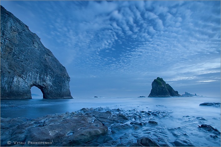
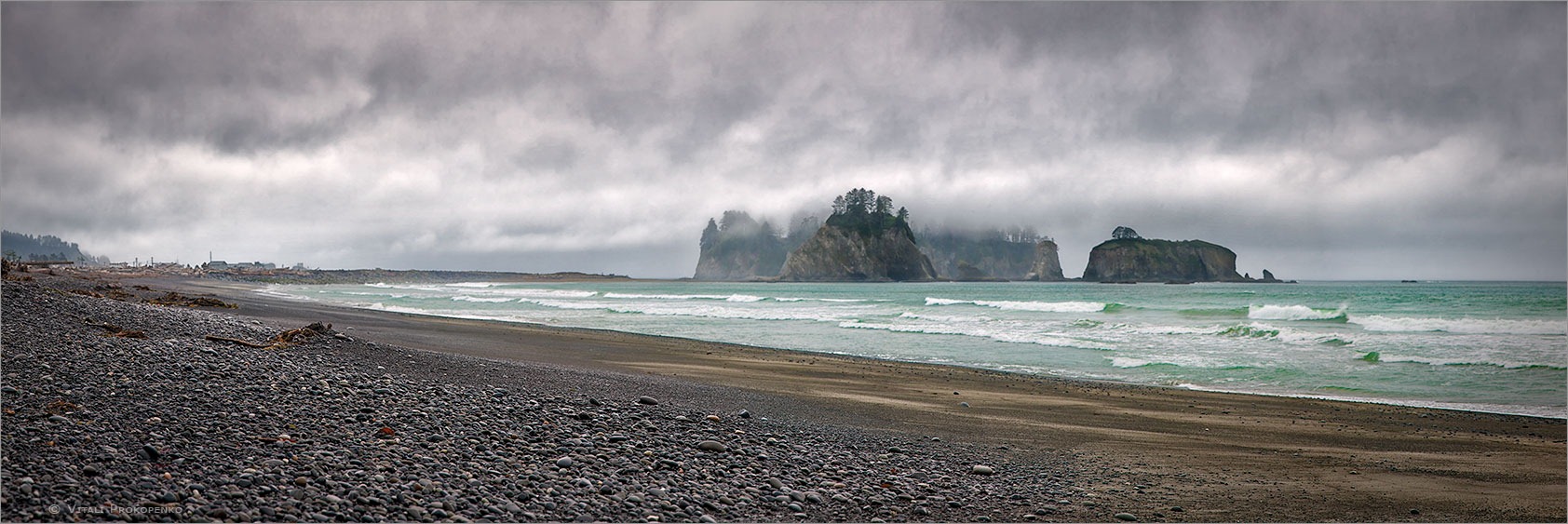
I did visit a place I had been to many times – Rialto Beach – but this time I walk past Hole in the Wall, further than I’ve ever been before. I was enjoying excitement of exploration, walking the ground I’ve never been to before, soaking in new landscapes.

That’s where I made this photo at twilight. It has some mysterious feel too it, strangely attracting the eye. I’m wondering if its mystery has anything to do with a you-know-which movie.

_MG_9190

Photographing Light

Can light be a subject of a photograph? I’m absolutely sure of it. More than that, light is often the main subject of my photographs.

A week ago I was walking in Seattle Arboretum looking for spring blossom. I made a few photos but nothing was clicking. I was ready to give up and headed back to my car, when I saw this light. Actually several kinds of light in one scene: rim light on tree branches, and sunrays breaking thru the branches forming a waterfall of light.

_MG_2481

Water in Motion

As I said in my earlier post Second Love Like First Love long forgotten love of waterfalls is coming back to me. Here are some results of it: new folio Water in Motion on my website containing old and recent images of waterfalls and tumbling creeks.

Bridal Veil Falls
Bridal Veil Falls

Stormy Sky

Do you wait for sunny weather, clear skies? I’m waiting for a storm. Lately I’ve been fascinated with stormy skies. There is some wild unruly power in them, something that makes me appreciate the Nature and its rejection of a human will over it.

Rialto Beach, Olympic National Park

This photo was taken on a rainy, cold and windy day when most people stayed home warming up by a fireplace. Not me. I was out there, trying to capture a beauty of elements.